(Women) who love gardening. The women are approximately between twenty-five and fifty years old.
Software
The final product I had to make was a magazine spread. A monogram logo was added and some product, branding and atmosphere photography. They come all together on the spread. The monogram had to be made by choosing different fonts and combining them together. the final decisions I made were based on the target audience
Single product branding
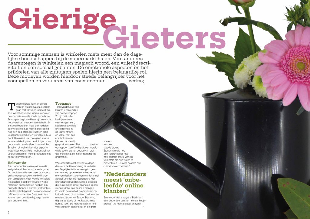
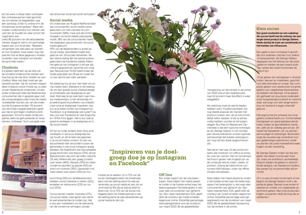
Before we started taking pictures, we made sketches of how it would look. Based on that, I photographed the watering can with a light box. The mood image is with flowers and plants, because the purpose of a watering can is to make plants and flowers grow better.
Logo design
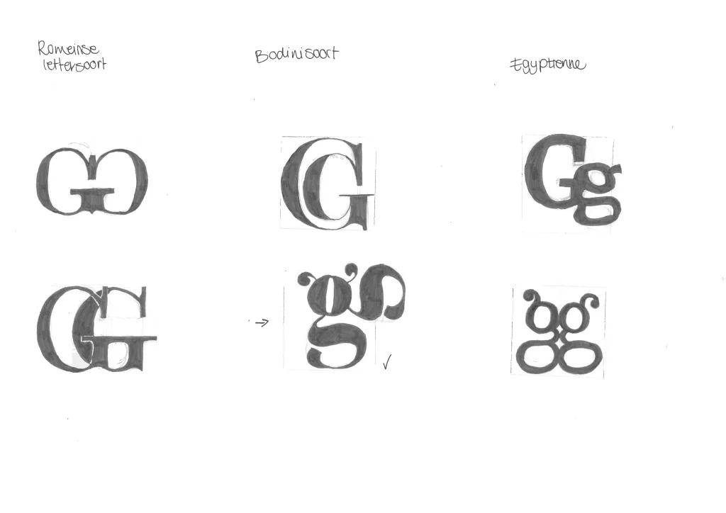
For the logo I made a monogram logo. A monogram logo is a logo that connects letters together. For this I connected different types of fonts together by sketching. Bodini typeface, roman typeface and Egyptienne are the typefaces I used. In the end I decided to choose the bodini type. Because the logo looks a bit more playful, but still very professional, because the font itself radiates that. It also looks a bit like there are two small feelers on it, which gives the feeling of gardening.
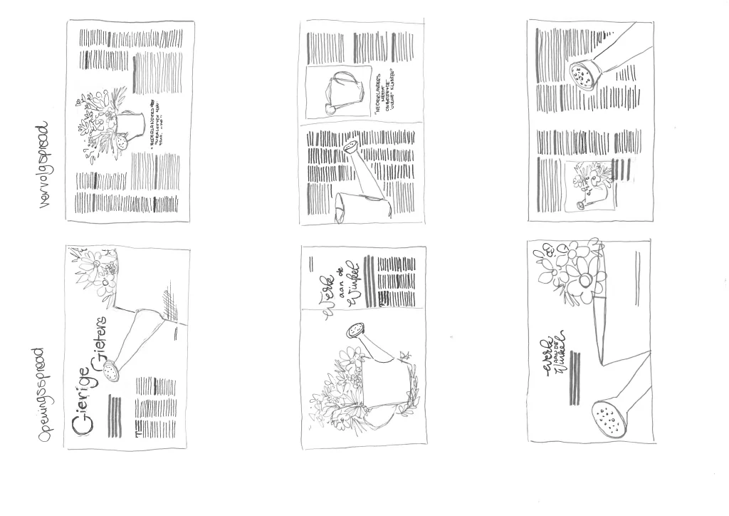
Sketches
Prototype website
To sell the watering cans I designed a webshop where you can easily buy the watering cans. This webshop is a prototype and I made it on UXD
Magazine spreads
The watering can is of course central to the magazine spread. That is why I depicted the watering can as large as possible on the opening and the follow-up spread. Before I decided on this, I made several sketches about how the layout would look. I learned a lot about how to design a magazine spread and what all the technical terms mean within the magazine spread.